Maybe 'gray-toning the pages' might be more accurate...
This is the 4th part in my series of posts chronicling my process in creating my latest comic book, WEAPON TEX-MEX Vs. EL MUERTO: THE BATTLE OF SANTA MUERTE!! This one is about the gray-tone coloring on the book. The previous posts cover:
The page above, which I showed the uncolored version of in the previous post about inking, provides a good representation of my overall coloring in this book.
I colored the book in Photoshop, after scanning in the inked pages at 400 dpi. I colored in gray tones, which is basically shades of black. I tried to limit myself to about 6 or 7 shades, which means in my color palette I would have 100% Black, 85% Black, 65% Black, 50% Black, 35% Black and 20% Black (as an example).
I'd have to make notes to myself (and in the Layers palette in Photoshop) to keep the colors consistent on the characters. So the 65% Black would be, let's just say, for Tex-Mex's pants and the Cadillac body. 35% would be for the shading on Muerto's skin and the beard stubble on Tex-Mex.
The reason for the limited amount of gray tones? It's my preference for coloring my own work. When I use actual colors, I try to keep the amount of colors I use limited as well. Aesthetically, since I draw my figures and environments with limited detail, or at least what we all call 'cartoony', I also like to keep the coloring on a somewhat consistent approach. My gray tones are meant to first of all fill in the line art, giving it volume and variety from other parts of the art. Some of the grays, like the beard stubble, are meant to provide an indication of texture.
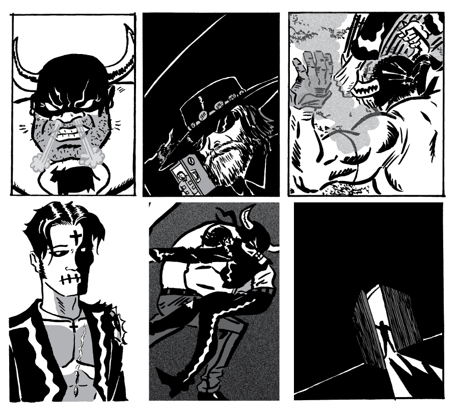
Here's a sample of panels from the book. They're not presented in the chronological order they actually appear in:
In the bottom, right hand panel, the dark gray compliments the lines on the door to illustrate the appearance of wood. While the black is used to show a stark shadow from the light outdoors. It also adds to the mood of the panel (it's the interior of an abandoned church), heightening a sense of foreboding....
Basically I want my coloring to 'get to the point' of what I'm trying to convey in the art. Colored pants, ominous shadows, medium colored door, tanned skin tones, etc. Part of that comes from trusting the reader's judgement to see it how I hope they will, and part of it comes from wanting to keep the process somewhat quick for me to work through. The third reason, and my first concern as an artist, is just the way I want my work to look. My approach to all the art I create (drawing, comics, painting) comes from an internal, emotional gut feeling. There's universal precepts and fundamentals of art that inform my creative process, but at the same time, telling a story comes from such an intuitive mindset, at least the way I see my role as the maker of these stories.
The background on this page was colored to provide an interesting alternate to a plain white background. Also, the textured pattern somewhat reminded me of blood splattering, underscoring the brutality of the fight without resorting to showing the blood spraying patterns all over the page. (Although I've done that in the origin issue of El Muerto....).
Here's an image I colored in gray tones before I started coloring the actual story. This appears in the interior front cover of the book.
Mr. Smith, the instigator of the tale...
I spent more time on this that I would have if it was an interior page of the story. I knew this was going to be a promotional piece of art used outside the actual confines of the story, so I didn't mind making this a much more detailed piece. It was also more meticulously inked, again, because I knew this wasn't going to part of the story. If I spent this much time and detail on every panel of the book, it would have taken me a lot longer to get it done, and as I've mentioned in previous posts, I had a deadline by when I wanted to ship this book off to the printer.
Even as I get quicker in using Photoshop to color, I still think I'd maintain my more simplified approach to coloring. Perhaps in a few years, that would change...
A favorite creator of mine is Go Nagai, a Japanese cartoonist whose prolific output includes Mazinger Z, Devilman and Cutey Honey, to name some of his most famous properties. His work, which like most manga is printed in B&W, really provides me with a lot of inspiration on how to approach coloring in gray scales. Here are 3 examples:
Above, a page from MAZINGER Z. Followed by pages from MAO DANTE:
In the DANTE page above, I love variety and balance of white, black and gray shapes throughout the page. When you add in the variety of textures that are inked in, the whole page just crackles with a lively panorama of imagery and tones.
I don't show these to say that my own coloring choices are meant to match the work done by Nagai, but rather to illustrate that by looking at other work we admire, we artists can often feel emboldened to go beyond the work we're normally satisfied in producing. What they call 'outside your comfort zone'.
As for working in actual color, here's the back cover of my book:
The 'Wanted poster' piece was relatively simple, as El Muerto is basically three colors (four if you count his Superman-inspired blue hair highlights!). I put in a Photoshop texture on the wall, complimenting the cracks I drew in the illustration. Overall a relatively quick color job, but very effective in showing exactly what it needs to.
The bottom strip was more of a graphic design piece, picking some limited colors to tie the various elements together. Again, no fancy tricks, just creating something that looks good, and delivers a simple message.
In the next post in this series I'll share with you my writing process.
Quick update: My new comic book, WEAPON TEX-MEX Vs. EL MUERTO:THE BATTLE OF SANTA MUERTE!! has been sent to the printers! Everything is on schedule for the initial batch of books to arrive in time to debut at the first-ever LATINO COMICS EXPO at the Cartoon Art Museum in San Francisco on May 7 & 8!
In the meantime, I'd like to share with you another stage on the process of making the comic. In two previous posts, I talked about my inspiration for the idea and how I started to put the story together. In this third part of the series (collect 'em all!) I'm going to show you the actual inking of the comic book. Because I was working so fast, I didn't document any of the penciled pages, except for a very few panels. Here's one:
And here's one of the thumbnails to a page. 'Thumbnails' is just another word for rough draft, or loose pencils, of an actual comic page. In my case, it's a sheet of cheap, white 8.5" x 11" paper. It's done to layout a page, planning what the final, finished page will look like. Here's where I figure out my pacing for the story, how the individual scenes are visualized for best dramatic effect, tempo, mood, staging, etc.
And here's the inked page, after I penciled it on a sheet of 11" x 14" Strathmore Bristol paper:
If you compare the two, you'll see slight differences. But really the actual sequence of events in the panels is about the same. That's what I mean by establishing my pacing in the thumbnails. When I sketch out the individual panels, I try to pick the best shot for that panel, but when I redraw the page on the larger sheet of paper, that's when I really decide on the best composition for that panel, and making sure I'm satisfied I staged the characters as best I can.
Compare another set, this one where El Muerto and Weapon Tex-Mex first meet:
Here, again, the action is pretty much the same on both pages. One key difference though is that in the final drawing, I decided to shift the angle a bit on the central image. I liked the original version where Tex-Mex and Muerto are literally facing one another as if each of them is looking in a mirror. But tilting the angle in the inked version makes it look like Muerto is sliding downward into Tex-Mex's clutches, heightening the sense of danger. One of my chief priorities as a cartoonist is to always punch up the dramatic cues in my artwork. If the scene, or even the characters, without any dialogue, can convey an emotional state to the viewers, then I feel the artwork has done it's job. But the visual impact is what I want to get across first, as that will be what the readers first process. This applies to quite, introspective scenes as well as chaotic action scenes. One of my favorite words to positively describe what I like about a comic book story, as a reader of comics, is visceral. If I can produce such a feeling with my art, then I've accomplished one of the things I hoped to.
For me, working on these pages allows me to totally disappear into the world on the page. In the thumbnail stage, I'm really focusing on crafting the actual story, pacing out the events panel by panel, page by page. Choosing the best shot, staging the characters, picking reaction shots from one character to the next. So much to figure out, even the size and shape of the panels. Everything on the comic page has to be given some consideration in how it's serving the telling of the story.
So as I work on the inking, my focus is on delineating the figures, picking textures for fabrics, hair and all the environments, determining shadows. While I wouldn't call that process mechanical, there's a certain amount of peacefulness I get just working on this stage of the book. And temporarily shutting out the real world, that's where that peaceful sense comes from.
One of my most powerful tools I use when inking pages is..... music. When working, I'll pick a playlist of music, usually film scores, that help me envision the world I'm creating. Soundtracks like BATMAN RETURNS by Danny Elfman and THE GOOD, THE BAD AND THE UGLY by Ennio Morricone were very helpful to me in staying in a particular mindset as I worked on my pages. Actually, those films have elements in them that I recalled when making my comic: the macabre mood and gothic nature of one film, and the Southwest grittiness and colorful characters (and their relationships to one another) of the other. It's an interesting well to draw from, but influences come from all sources.
Here's two examples of the soundtracks from the films that helped me zero in on the mood I was tapping into for my story (if you're reading this blog via Facebook, these Youtube clips won't show up, but if you visit my blog, you'll be able to play them):
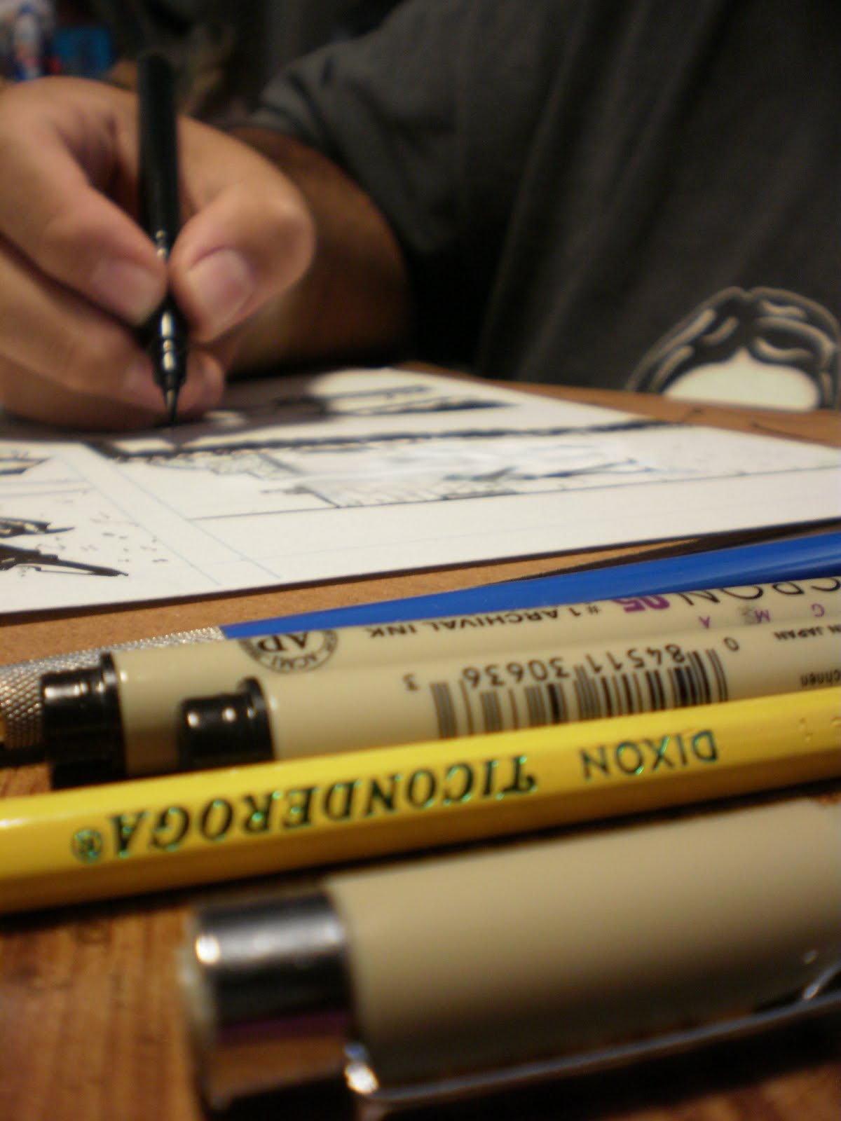
As far as physical tools go, the photo below shows you what I use to ink the pages. On of my favorite new tools is the lead holder (the blue instrument). I've usually used Prismacolor non-photo blue pencils for the penciling stage, right before inking. But a friend of mine gave me the lead holder last year, and I like using it with a non-photo blue lead to do my penciling. Can't really explain why I like it better, but perhaps it's because I use less pressure (so the lead doesn't snap), which seems to allow me to get a little looser with my linework.
For brushes, I pretty much always use a '00' Winsor Newton and a #1 for larger areas. I'll be honest, I'm not that picky if it's Sable or synthetic or made from the nose hairs of an albino yak! Just as long as it lays down the ink like I need it to.....
Another favorite new tool is the Pentel Brush Pen, made in Japan, no less. I'm still getting the hang of it, but it does produce some nice long, delicate brush strokes. And I like not having to clean it, unlike a brush.
Okay, next time, I'll be sharing with you my process for coloring the story, in gray tones. Thanks for reading, and feel free to leave comments. Always curious what people are thinking about in response to what I wrote.